
Verizon Contact Us


The Problem
Verizon Fios’ contact page had become a big problem for the Customer Service department.
Users found the current page extremely complicated and outdated. As a consequence call volume continued to increase to almost unmanageable levels.

The Goals
As part of a bigger redesign effort, we aimed at creating an improved and cohesive experience that would align with the others area of the Fios website, which were being redesigned.
To take advantage of the Branding redesign to leverage resources that can aid in the improvement of other areas on the site.
To understand customer needs and the pain points they experience with the site.
To gain a better understanding of how a Customer Service Associate’s work is affected by customer problems.

The Team
This was a fairly independent effort lead by the Fios design team in collaboration with the Research & Analytics team, and a section of the Wired Engineering team.
As the Lead Designer for this project I was able to collaborate with specific partners in each of the supporting teams.
Later in the project I had the opportunity to bring in a Junior Designer with whom to collaborate during the Detailed Design phase of the process.
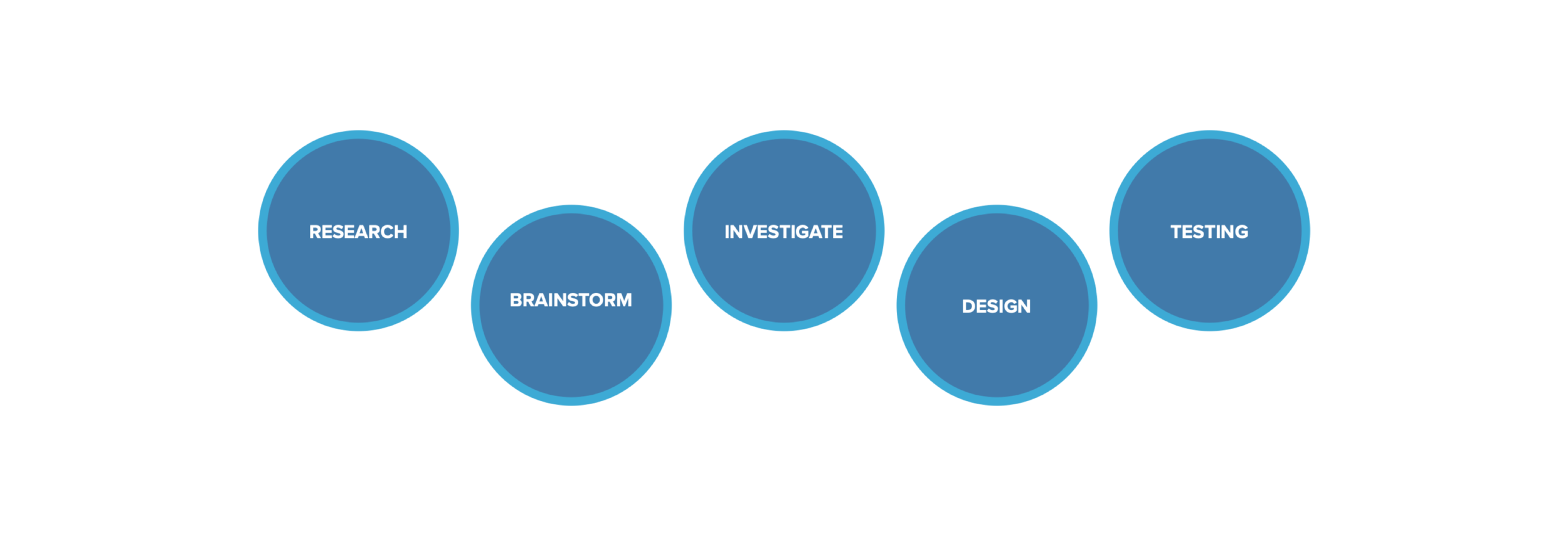

The Process
The structure of this project was based on the availability of research resources already in place. A lot of emphasis was put on brainstorming sessions, and Competitive Analysis, which took place during the Investigate phase of the process.

Research
The Research and Analytics team had done a lot of legwork in preparation for this effort, we built a strong relationship with the team and leveraged the information and data that had been gathered over the past few months.
Most of the data received was of quantitive nature so the rest of the research was based on analyzing User feedback obtained through a set of user testing sessions and surveys, in order to assess qualitative results.
To complement this data we studied customer service reports that contained a different set of customer feedback.
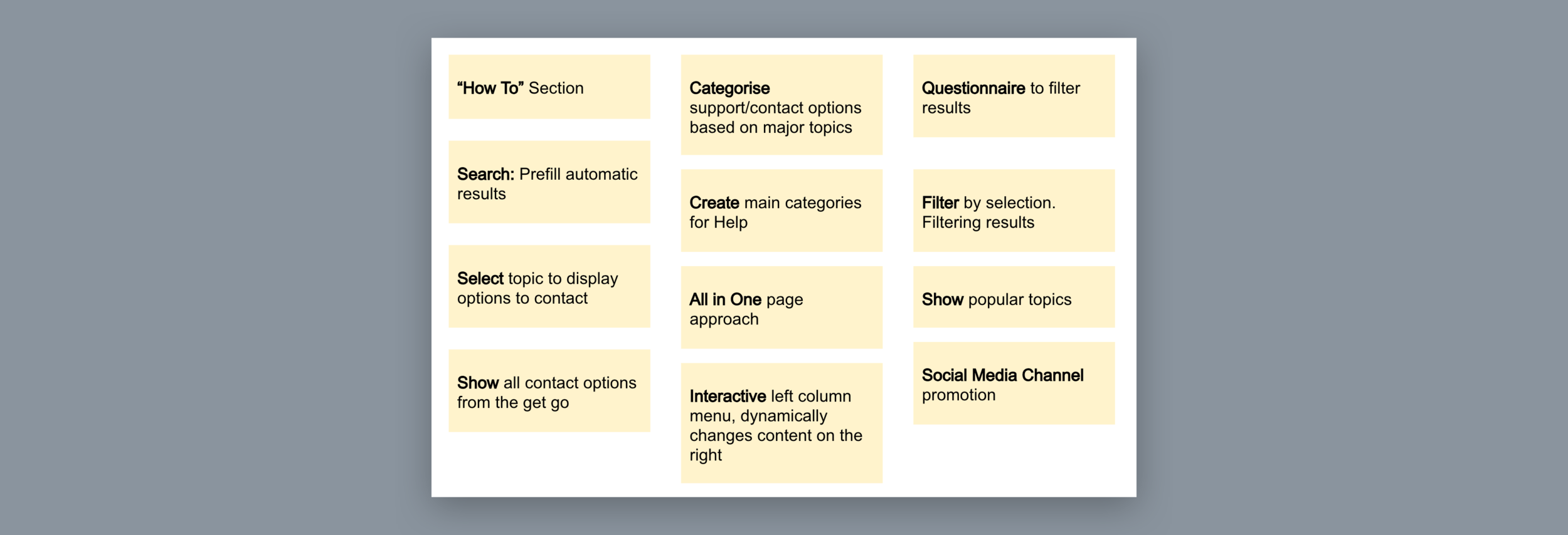

Brainstorming
Based on the results from the research, we organized 2 Brainstorming sessions in which we ideated initial thoughts around the areas that should be tackled within the Contact Us site.
Whiteboarding sessions were geared towards generating individual ideas that could become part of bigger concepts as we moved forward.
Prioritization exercises took place to identify the ideas that aligned closely to our overall objectives and technical capabilities.

Investigate
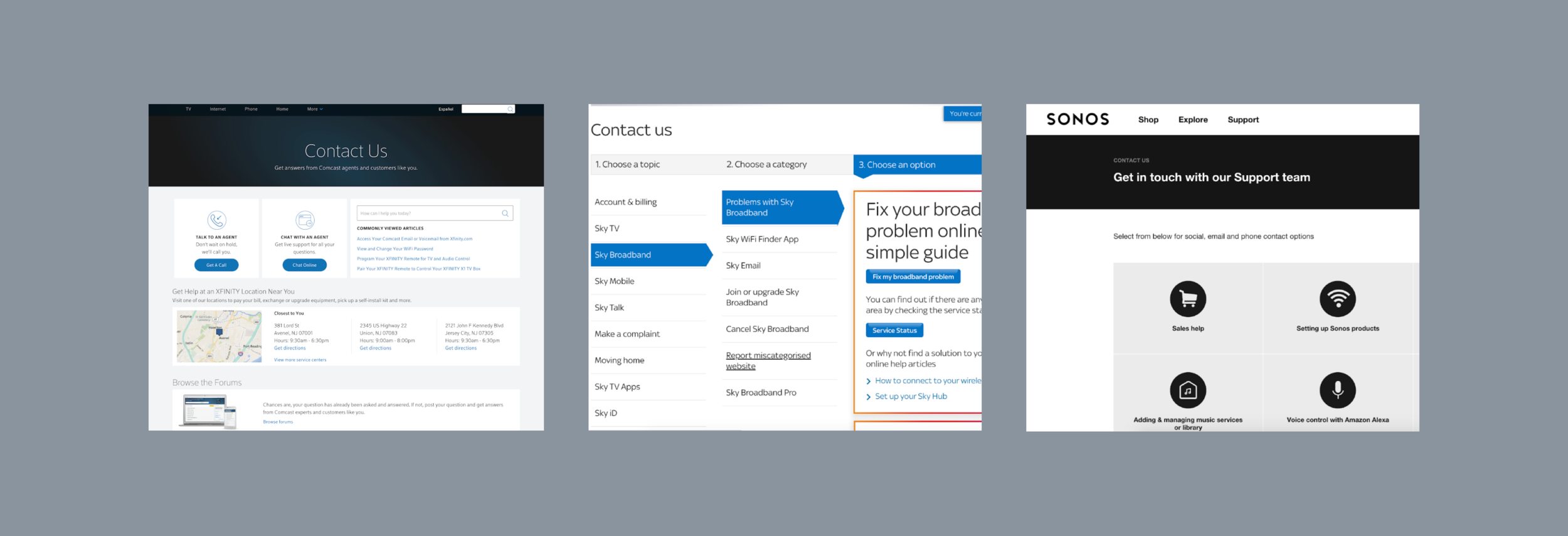
Based on the ideas generated during the Research and Brainstorming sessions we crafted a plan to perform additional research on Competitors.
Companies in the same industry, as well as several in different fields, were analyzed, in order to study existing solutions, identify best practices, validate concepts and highlight key features.
Some Key Research Findings included the need for Minimum Cognitive Load, Multiple Channels, Comprehensive Searching Capabilities, Popular Topics and Clear Navigation Patterns.

Design
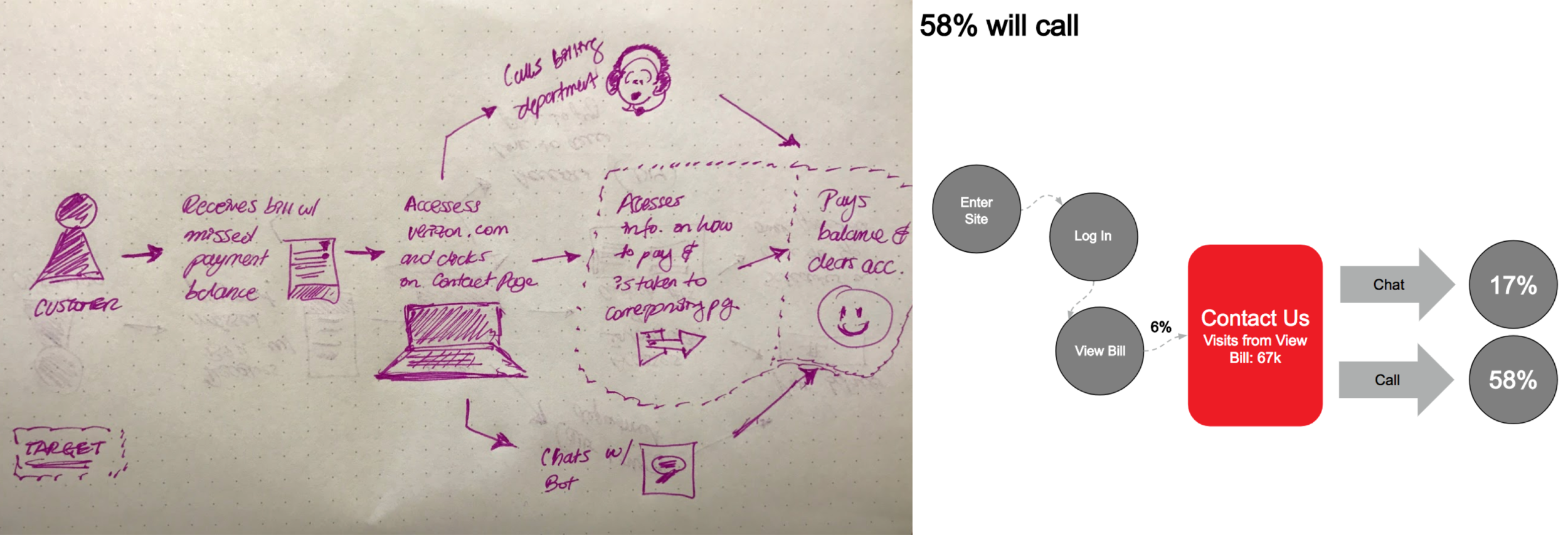
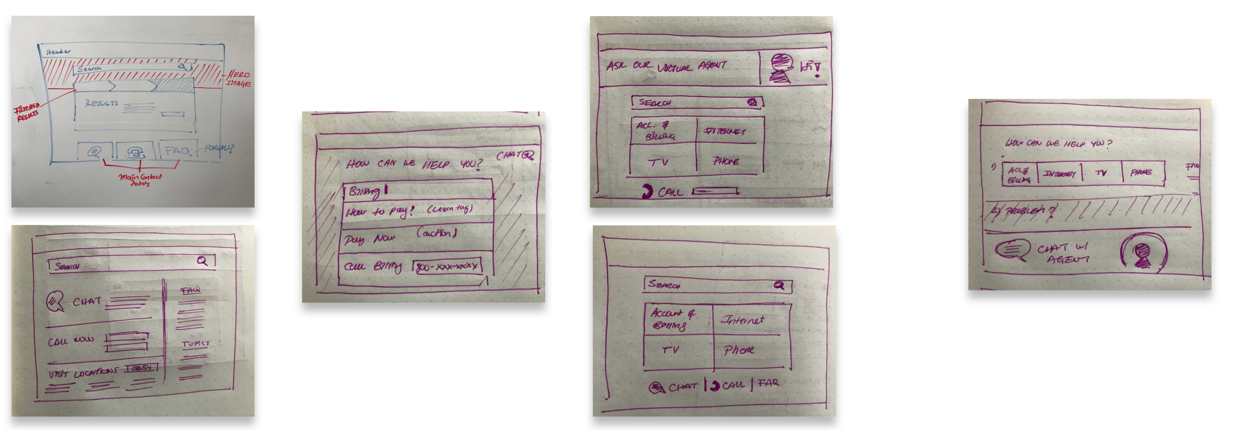
The Design process consisted of an extensive Concept phase where Sketches were developed to address an Ideal Experience Journey.
Additionally, a series of sketches were generated to tackle the key features that would become part of the overall Contact Us Experience.
A Web First approach was decided given the user tendencies. Eventually a fully Responsive experience was the answer, after exploring the possibility of providing a Native experience.

Wireframes
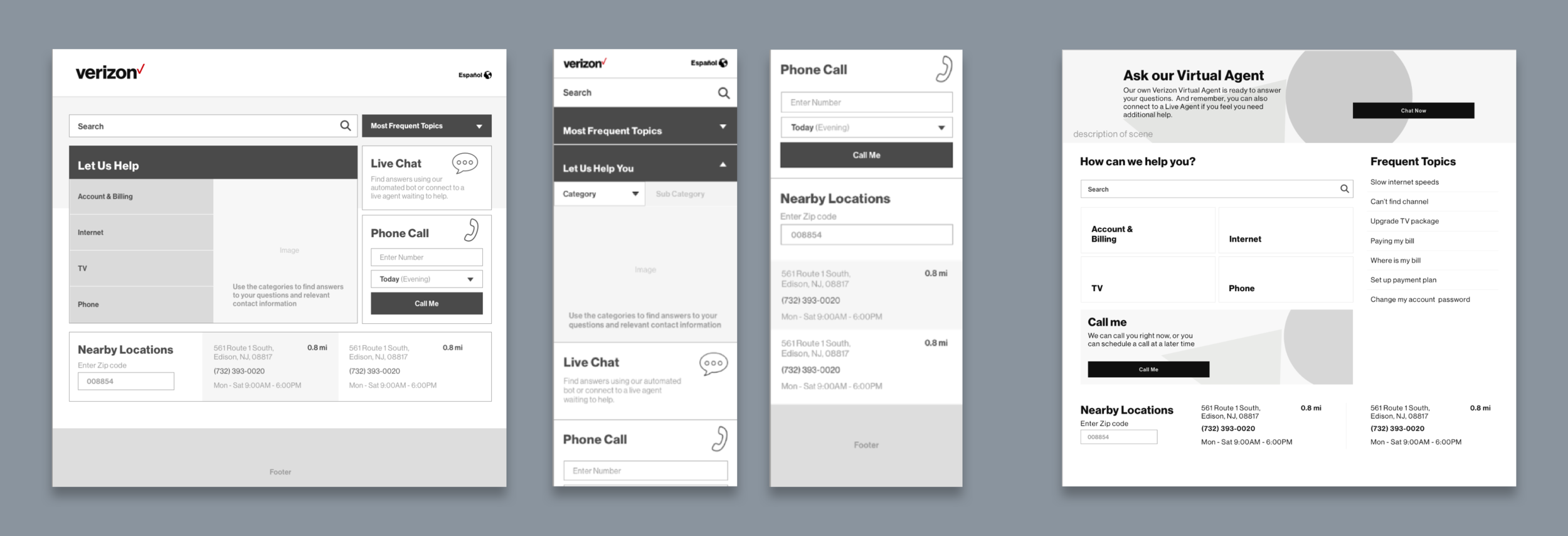
Several rounds of Wireframes were run along with their respective Feedback rounds.
We sought immediate feedback from Design Peers, Tech Partners and Customer Service Associates.
This process informed the creation of more refined Wireframe flows, and different versions that focused on different “Hero" features. These concepts were tested to identify which features needed more prominence, which features were necessary, and as a result develop a consolidated approach.

Final Design
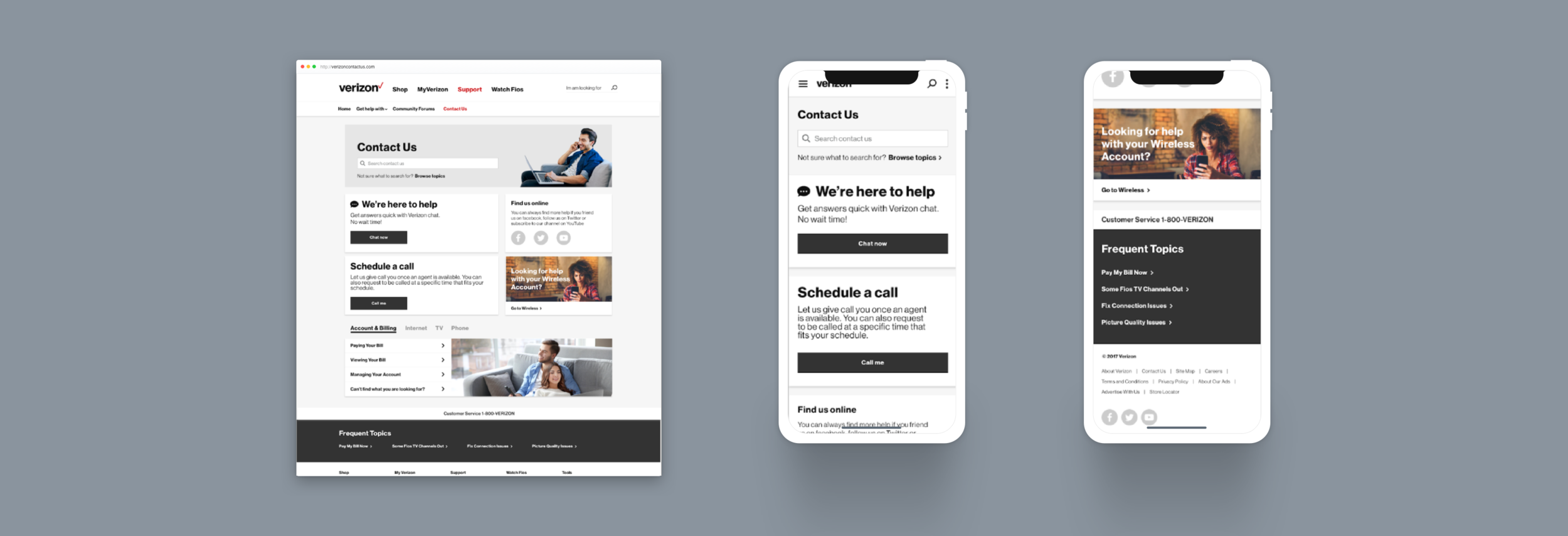
Once functionality was finalized, we explored the concept visually. We worked through 3 rounds of concepts in order to set the final Visual Direction.
As mentioned before, we wanted to take advantage of the big redesign effort taking place at the same time. We were able to use new Design Patterns that have been established, which allowed us to provide users with a refreshed look to complement the new experience.
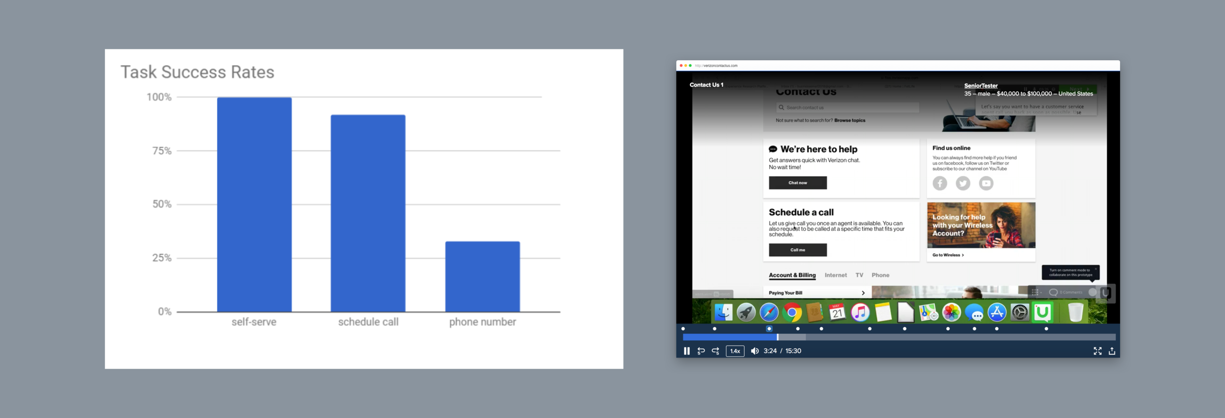

Testing
A final User Testing campaign was run to test the developed concept and directions. AB Testing was performed using the two final concepts.
We ran Moderated and Unmoderated Individual sessions, as well as Focus Group ones.
We made use of existing customers and propel who had never interacted with a Verizon product before, in order to gain an understanding of different perspectives and assumptions.

Outcome
The redesign received overwhelming positive reviews. The reaction from the customers proved the team was moving in the right direction.
The Customer Service department saw a substantial reduction in calls from existing customers as a consequence of the release.
Additionally, we experienced an increase in the Conversion Rate to 100%, when it came to Users who visited the site and were able to resolve their issue.