
Intellix User Enrollment


The Problem
Capital One’s (C1) Enrollment process for commercial clients has become a major hurdle in the effort to expand the list of companies using banking products.
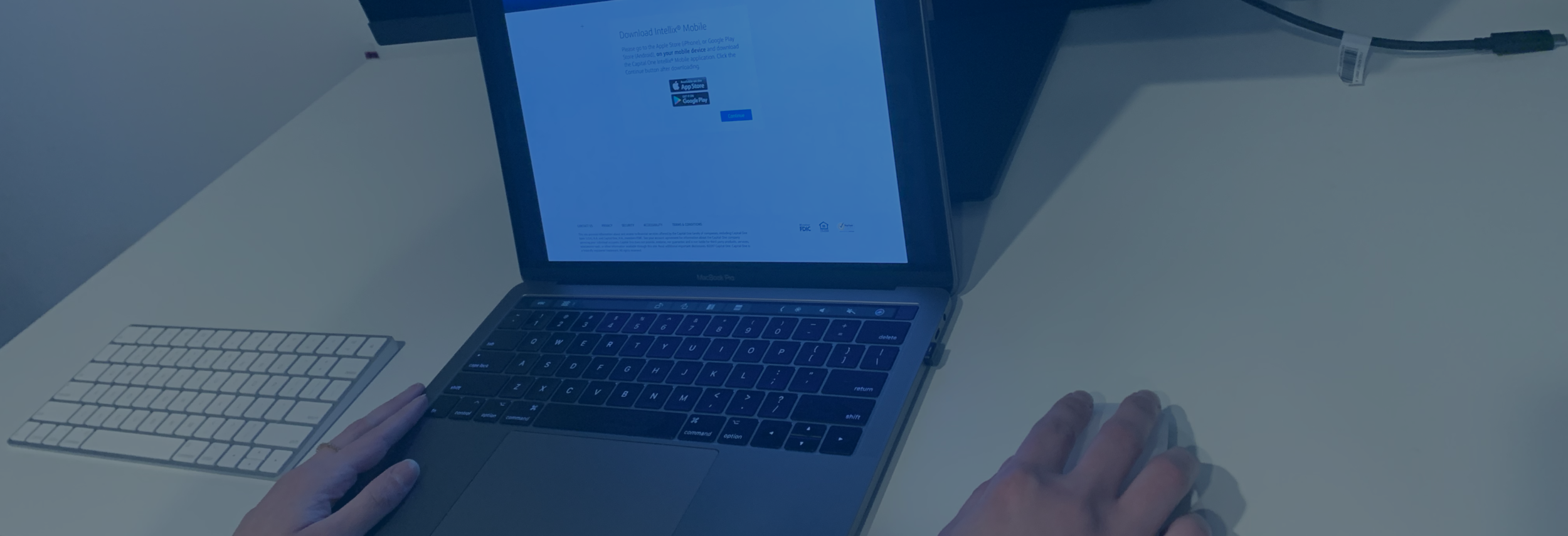
Users go through a complicated process that requires them to complete steps in different platforms (Desktop and Mobile) at different stages of the process. Users and client admins have difficulty with confusing instructions, which causes a need for extensive support from customer service associates.
Additionally, users can only complete the process using a Desktop computer as full mobile support is not available.

The Goals
We needed to understand the reasons why users find the enrollment process so difficult and complicated.
We sought to gain a better understanding about how C1 associates interact with clients and with their own interfaces during this process.
To create a seamless experience that does not require the use of multiple platforms in order to complete the process.
To reduce the necessity for user support, freeing C1 associates to optimize their time fulfilling other pressing tasks.
To understand and address security concerns due to the sensitivity of the information and financial transactions housed within the product.

The Team
I was brought to this project as a consequence of my work with the Mobile application, my familiarity with the platform and our user base gave me the opportunity to identify this as a necessary effort in the quest to provide our users with a more robust Commercial Banking experience and create better opportunity to achieve business goals.
As the Design Lead in the project I worked with 2 additional designers, who worked on specific aspects of the process, specifically on the alternative authentication methods we developed.
Additionally, we collaborated with a team of engineers (backend and front end), 2 Product Managers, 1 Project Manager, and a Cyber Security team in charge of addressing all security aspects of the initiative.
We remained in close contact with Commercial Bank leadership, Business, and Design, in order to maintain transparent communication channels and obtain support needed to keep our goals in check.
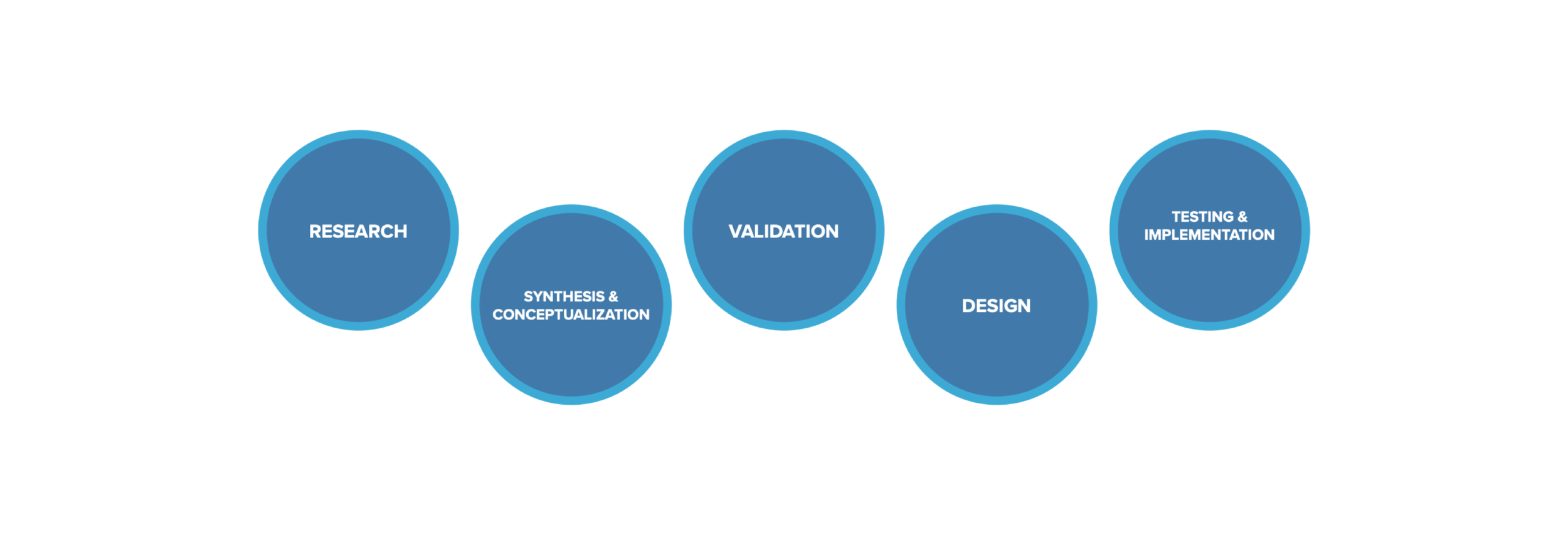

The Process
The process we created for this project was aimed at understanding the current experience, our audience from 2 different perspectives (internal and external), identifying problems and opportunities, crafting a solution that could be easily scaled in the future, while making sure this effort could be taken up by newer teams during future stages without crippling the progress.

Research
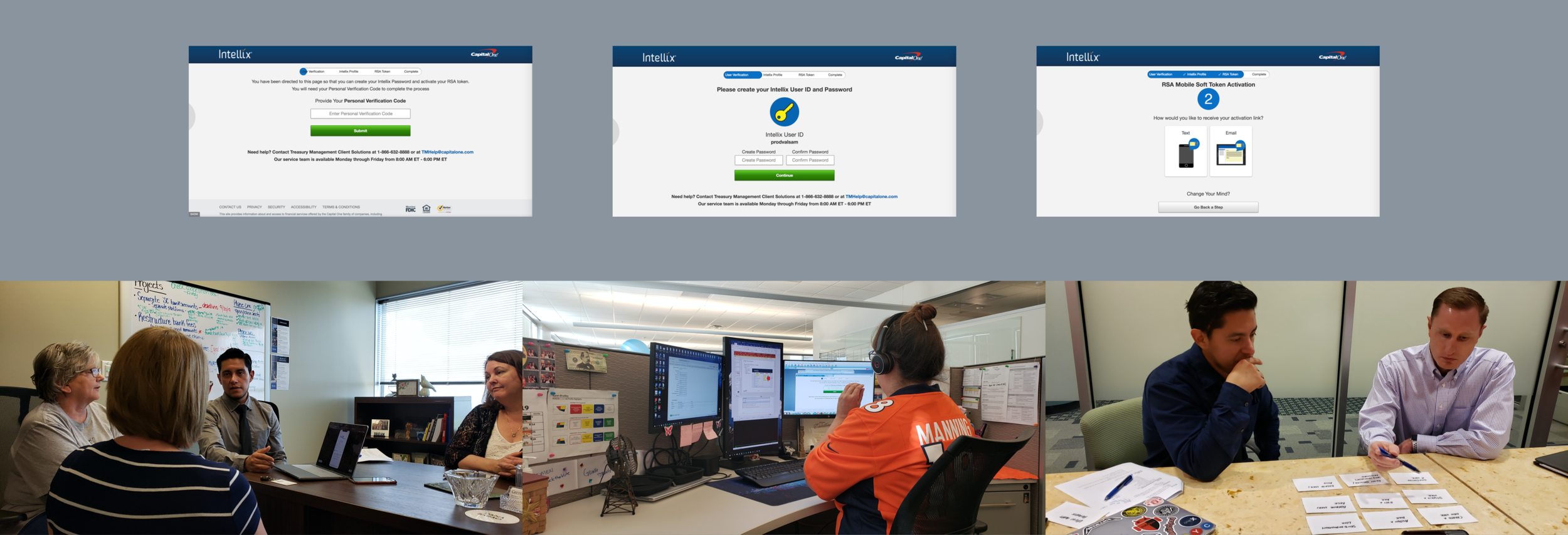
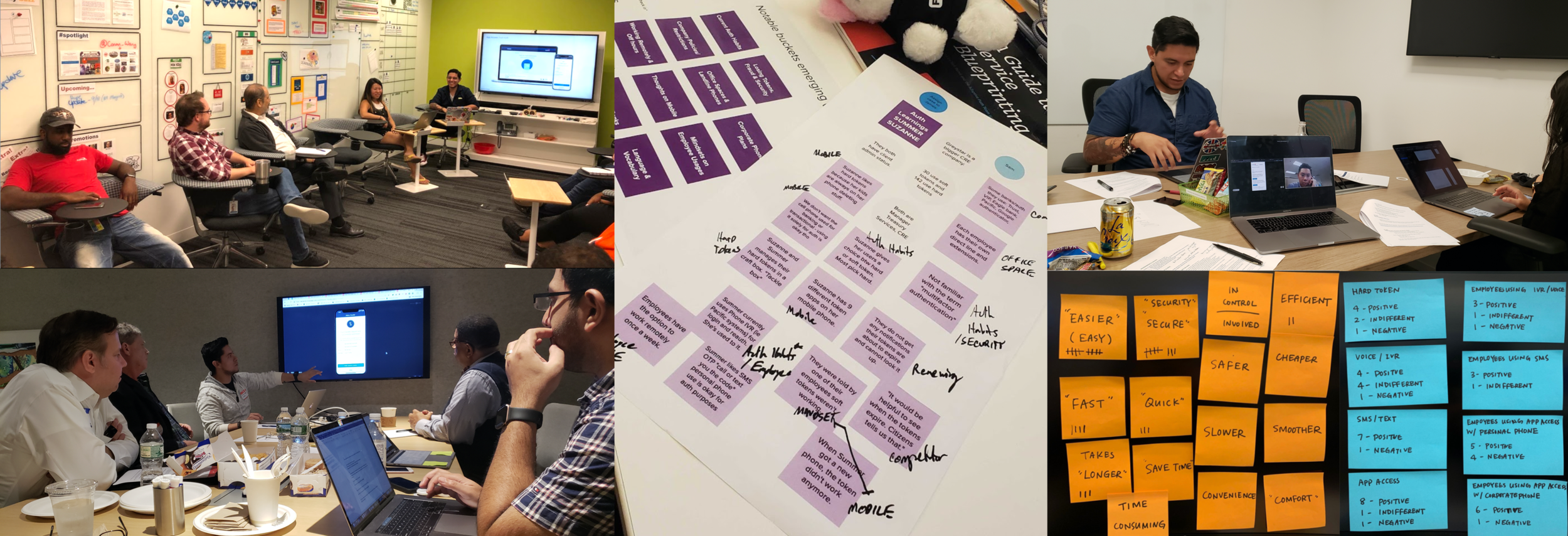
As part of the research effort we engaged in a set of interviews, walkthroughs, and shadowing sessions with C1 associates who work with the product on a daily basis.
We crafted a plan to identify customers who had high numbers of users and enrollment requests. We sat down with them and performed empathy interviews, walkthroughs, shadowing sessions and collaborative exercises.
A big part of the Discovery phase was spent analyzing the existing documentation and auditing the current process in order to identify current gaps and issues with the experience.
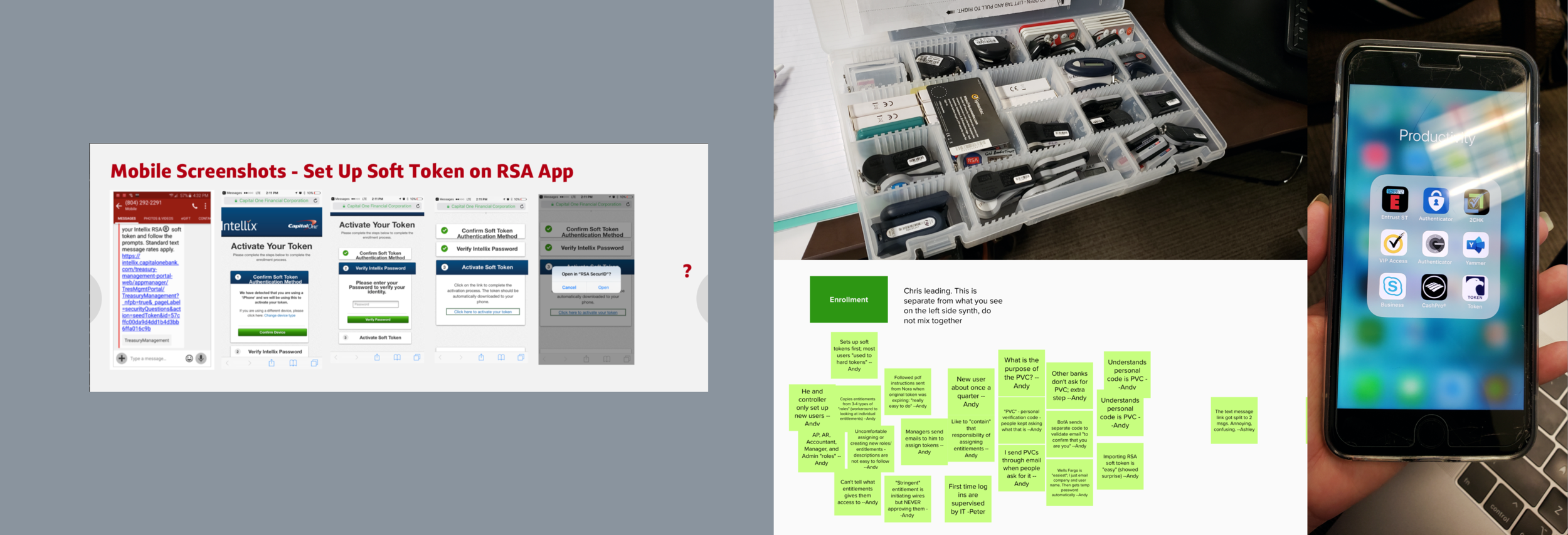

Initial Findings
The process had not been updated in quite some time, it suffered from a lack of consistency, clarity and functionality. The outdated design made it difficult for customers and associates to interact with the different interfaces.
Customers were frustrated with how difficult it was to understand the process on their own, and how complex the instructions provided were. The multiple levels of authentication, the requirement to use both Desktop and a Mobile phone in order to complete the process, the lack of trust in the security the experience offered, were all factors that prevented customers from achieving their goal.
Associates suffered from a lack of time to perform their main tasks due to how much time was spent helping customers get through this process.

Conceptual Round
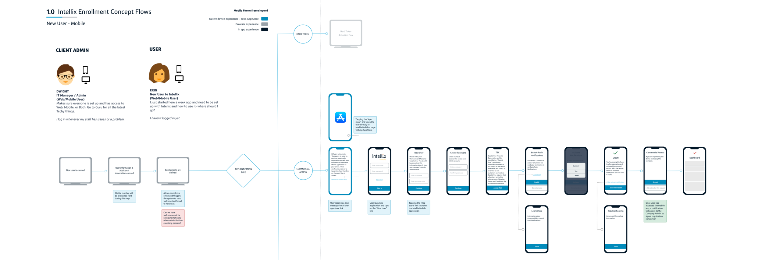
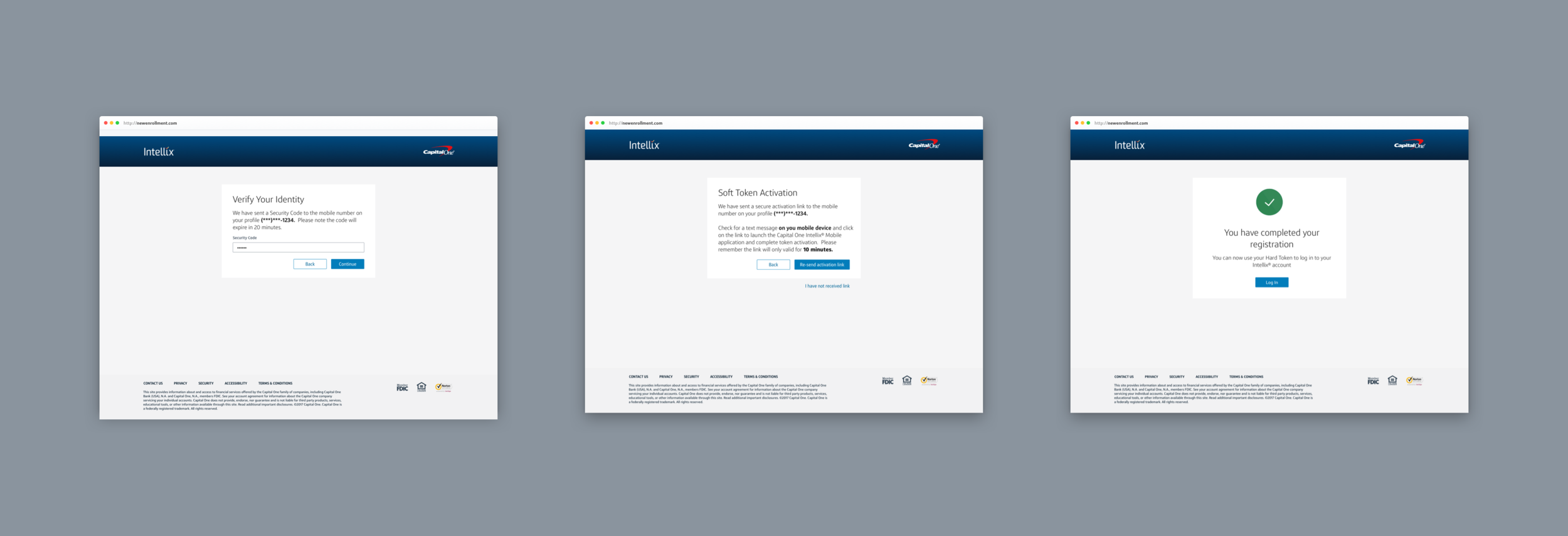
After several weeks spent researching and analyzing findings, an initial concept was created. This concept was based on the idea that the process should be able to be completed using only one platform. It was decided then to take a Mobile first approach.
This concept aimed to address the pain points found and streamline the process in a way that would provide the customer with more independence and a more intuitive experience.
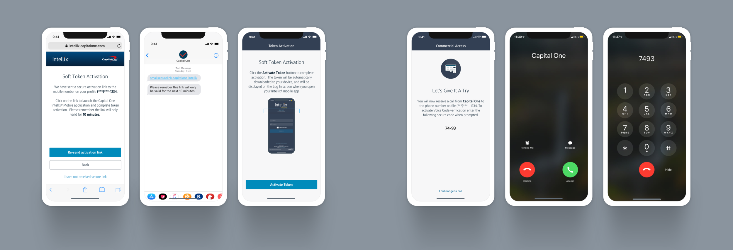
We eliminated the need for unnecessary levels of authentication by providing alternative ways to deliver secure codes and user names, while still addressing the security requirements through MFA. Hard Tokens seemed to be a thing of the past and there was business intent to move away from them.

Validation
A set of collaborative workshops were set in order to validate the concepts created during the previous phase.
We created separate sessions to address specific parts of the process including Security, Front end and Back end Technical Capabilities, Business Needs, and Design.
Initial paper prototypes were crafted in order to validate the process flow during initial testing sessions with Proxy Clients.

Refining Concepts
Based on the feedback generated during the Validation stage we went back to the drawing board and refined our concepts.
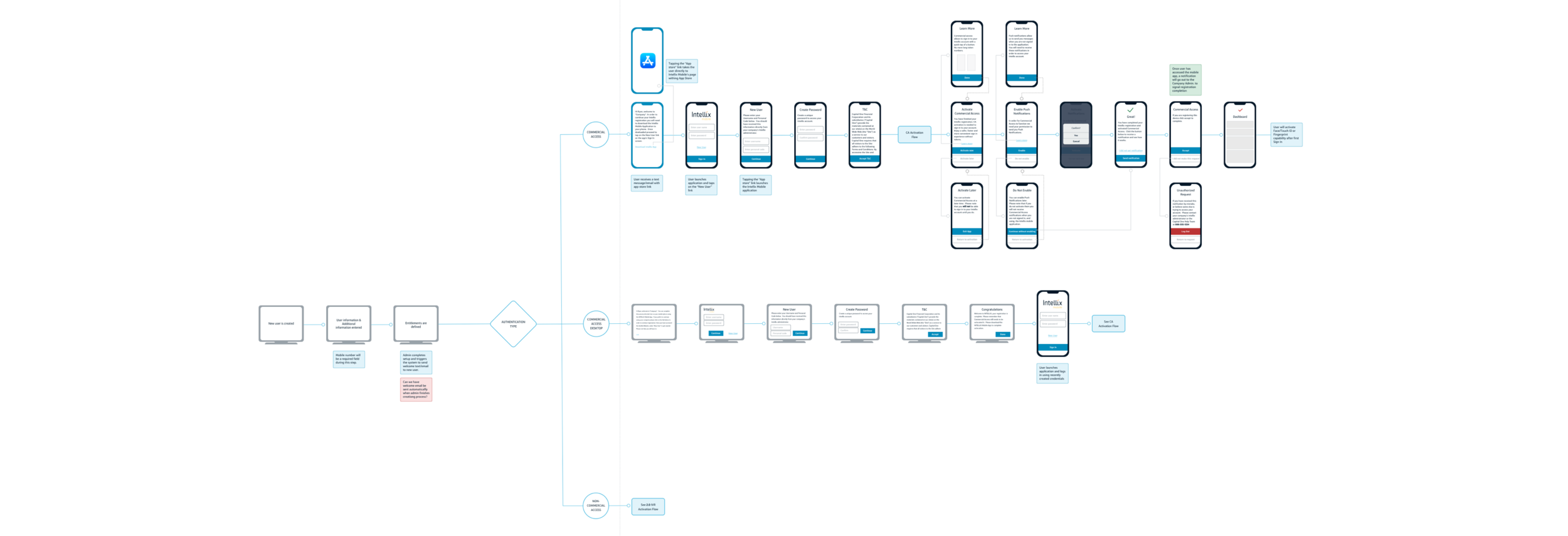
We created a clearer definition of the requirements and identified additional use cases that required us to create variations of the original process in order to address different sets of users.
We still kept a mobile first approach, but now we realized the solution needed to be a fully Responsive experience. The initial hypothesis that Hard Tokens were a thing of the past needed to be revised and we now needed to address both Hard and Soft Token registration processes as part of this effort.

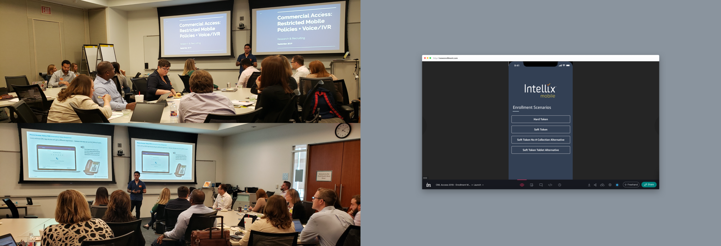
Addressing Multiple Cases
We arrived at the conclusion that different types of authentication were needed based on the restrictions and policies of certain clients, when it came to devices their employees were allowed to use.
A big section of Commercial Bank Customers had policies in place that did not allow the use of Mobile devices. Therefore, we had to come up with an alternative to our main way of authentication via OTP SMS. We implemented Voice Verification using main phone lines as an alternative.
Additionally, we crafted a separate experience for a major user base who only had access to Tablet devices, no Phones or Desktops.

Taking Mobile to Desktop
Once the full mobile experience was defined, we switched efforts to the translation of the process to a Desktop friendly experience.
This was taken on account from the beginning of the initiative making it a more smooth process for us to generate the flows.
We crafted a fully Desktop based experience for Hard Token users (users who do not need a Mobile phone to authenticate), but we also allowed Mobile users to perform a big part of their Enrollment flow using a Desktop computer and still be able to finish their Soft Token registration using their own Mobile device.
This allowed us to give users a choice, a main goal of this project.

Testing & Implementation
After another round of internal workshops, this time getting every team together for 2 big sessions, the designs and the flows were finalized.
We made use of the existing Design Language for Commercial Bank products, in order to create a more consistent experience throughout Commercial Banking.
Several prototypes were created, each aiming at addressing a specific Use Case. This was a better way to socialize the design and obtain targeted feedback for each of the features that needed to be implemented.
We worked with the engineering teams to start the implementations process as we continued user testing and validation.

Looking at the Future
As part of the effort to continue to improve this process, two additional pieces of the initiative were crafted.
A redesign effort aimed at improving the Instruction Package clients obtain from C1. Creating a simpler, clearer, set of instructions.
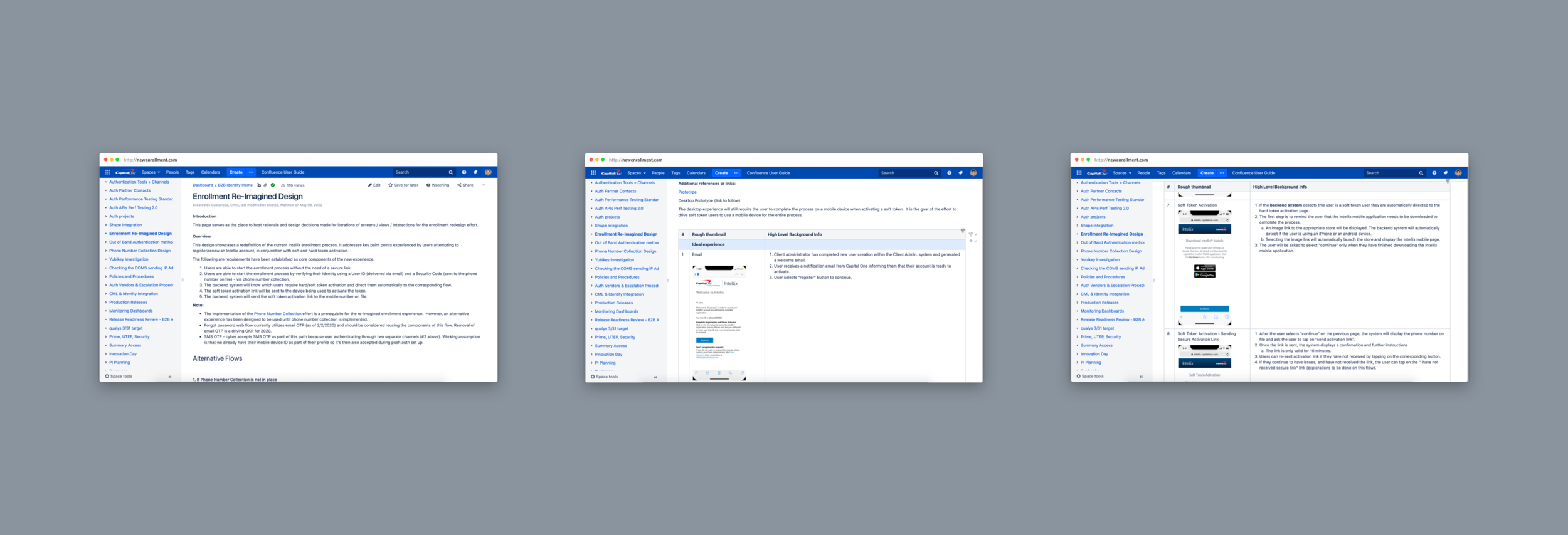
The creation of a living document that contained all information about the effort, research, design plan and execution. This was done with the goal of allowing new teams/team members to take over without missing a beat, given that this was an ongoing, long term effort.