
Commercial Account Opening


The Problem
Customers were disappointed and frustrated with the current system, the tools that were available did not provide users with a fast or reliable experience. Users were still relying on outdated methods to send information and documentation to the right Capital One (C1) associates.
This all led to more calls being made, slowing down the process and causing more delays.

The Goals
As part of an ongoing redesign effort, we sought to understand the reasons why customers were having a difficult time obtaining new accounts for their businesses.
To gain a better understanding of why C1 associates found it difficult to process client requests.
To develop a plan that could address road blocks in both areas, Client and Associate, in a short period of time.

The Team
A fully stacked team was assigned to this project.
As the Lead UX Designer, I had ownership of the entire Design Process with the exception of the final Visual Design execution, which was lead by a specialized Visual Designer.
I was able to collaborate with 1 Interaction Designer, 1 Project Manager, 1 Visual Designer, and a team of internal Engineers, that we used on a consultant basis.
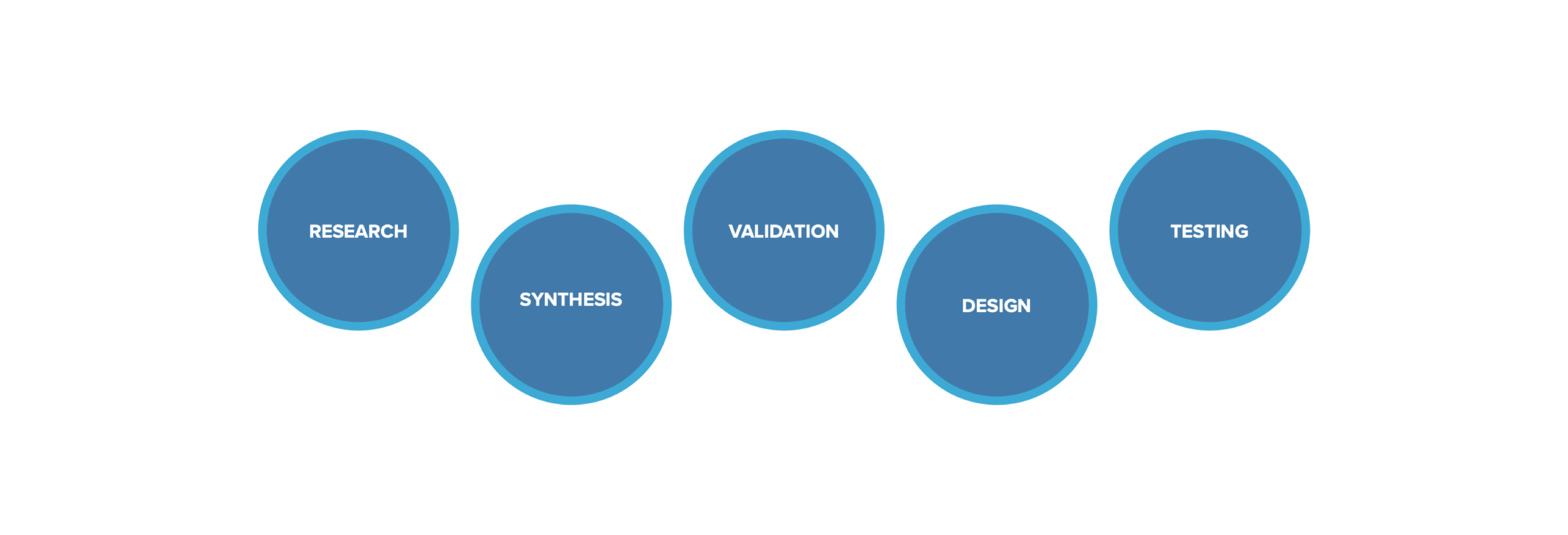

The Process
Due to the available resources for this fast paced project we were able to create a typical process structure rooted on the idea of immersive research and validation.

Research
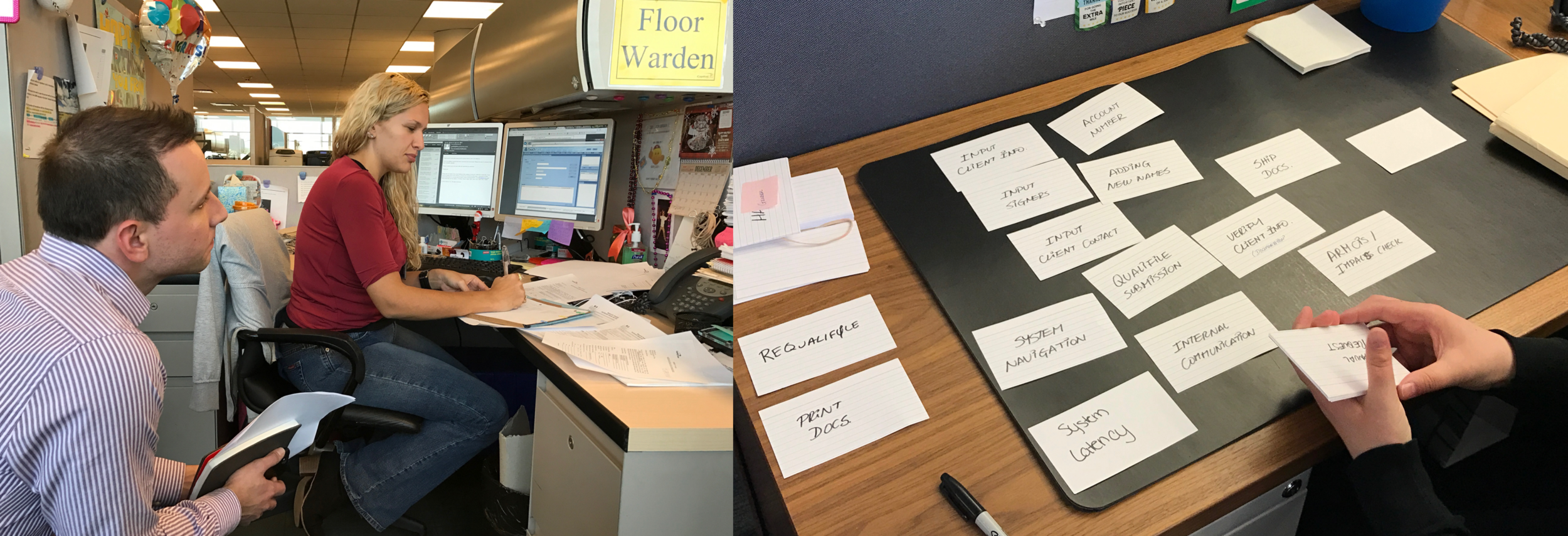
We crafted a plan that required a clear split between Internal and External research. We needed to understand the way customers interacted with C1 today, but at the same time we needed to see how C1 associates worked behind the curtain.
Interviews, individual and group working sessions were held with both Clients and Associates.
Intense audit and analysis of the current process was performed.
Additionally, a set of Q&A sessions with our technical partners were used to keep our feet on the ground from the beginning of the process.

Findings
After diving deeper into the Account Opening process we were able to identify key themes that encompassed the main road block creating issues, and opportunities for process improvement.
We placed those issues into 5 different categories:
Speed and Effort.
Human Experience.
Account Number.
Transparency.
Setup Confidence.

Validation
A series of Client and Associate workshops were crafted in order to validate the findings.
Initial testing was a part of the sessions to make sure the potential solutions were addressing the right issues and not creating further problems.
The technical team continued to be a presence making sure we did not conceptualize ideas that could not be executed.

Design Plan
Once the direction was validated we made the decision to approach each of the issues individually.
This meant that we needed to work on finding solutions for each aspect while still working on keeping a cohesive experience.


SPEED & EFFORT
Problem
Difficulty making submissions due to the effort it takes to enter information and submit documentation multiple times.
Solution
Effort is minimized using templates and pre-obtained information. Existing documentation is leveraged and pre-loaded.


HUMAN EXPERIENCE
Problem
Users feel disconnected when using automated tools. The best part is the personal relationship.
Solution
Personal aspect is always present. User is able to maintain constant communication.


ACCOUNT NUMBER
Problem
Account numbers are obtained manually. Users experience delays on paperwork due to not being given an account number while the account opening request is being processed.
Solution
Account numbers are generated automatically after submission.


TRANSPARENCY
Problem
Users experience a lack of transparency. Constantly having to ask for updates on status.
Solution
Status labels and proactive notifications provide users with the required updates.


SETUP CONFIDENCE
Problem
Lack of communication when an account has been created, or features have been activated, causes uncertainty.
Solution
Detailed confirmation emails automatically generated when a submission has been approved.


Individual Scenarios
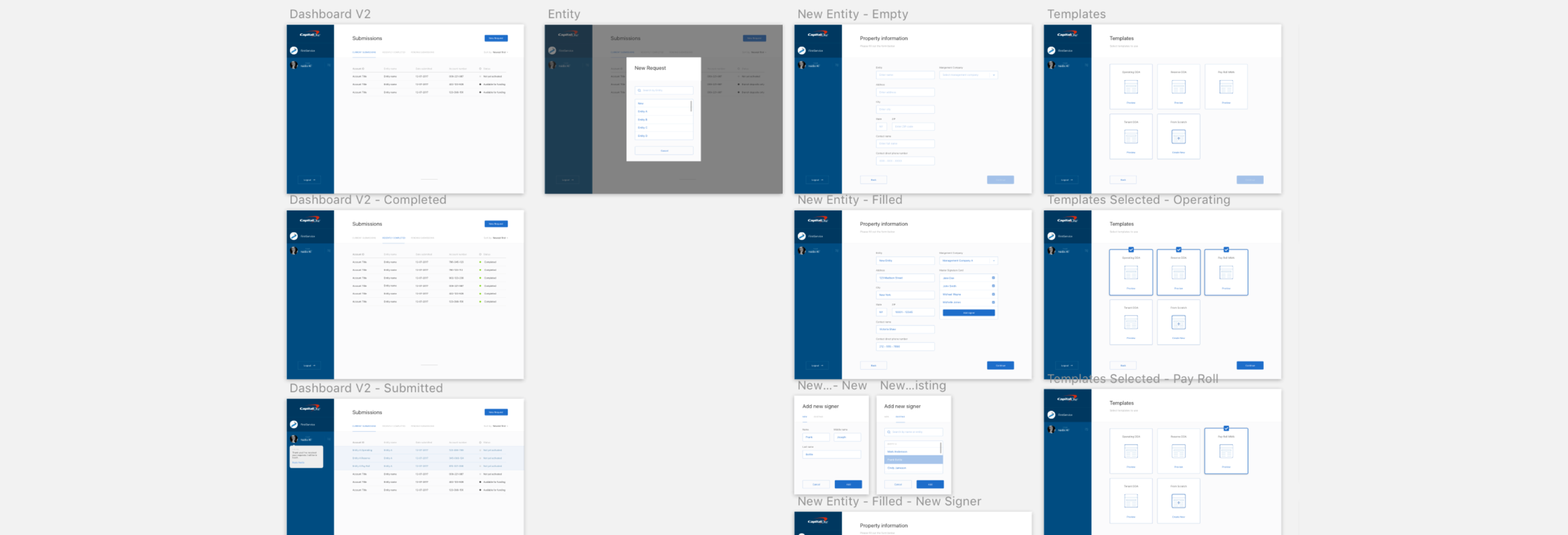
As part of the Design effort, we decided that it was important to generate a set of specific scenarios that would address the most common use cases and at the same time provide a basis for future ones that could be identified.
New entity + existing template
New entity + existing template + new signer
New entity + blank template
Existing entity + blank template
Existing entity + existing template
We created a set of Wireframe flows that laid out these scenarios from start to finish.

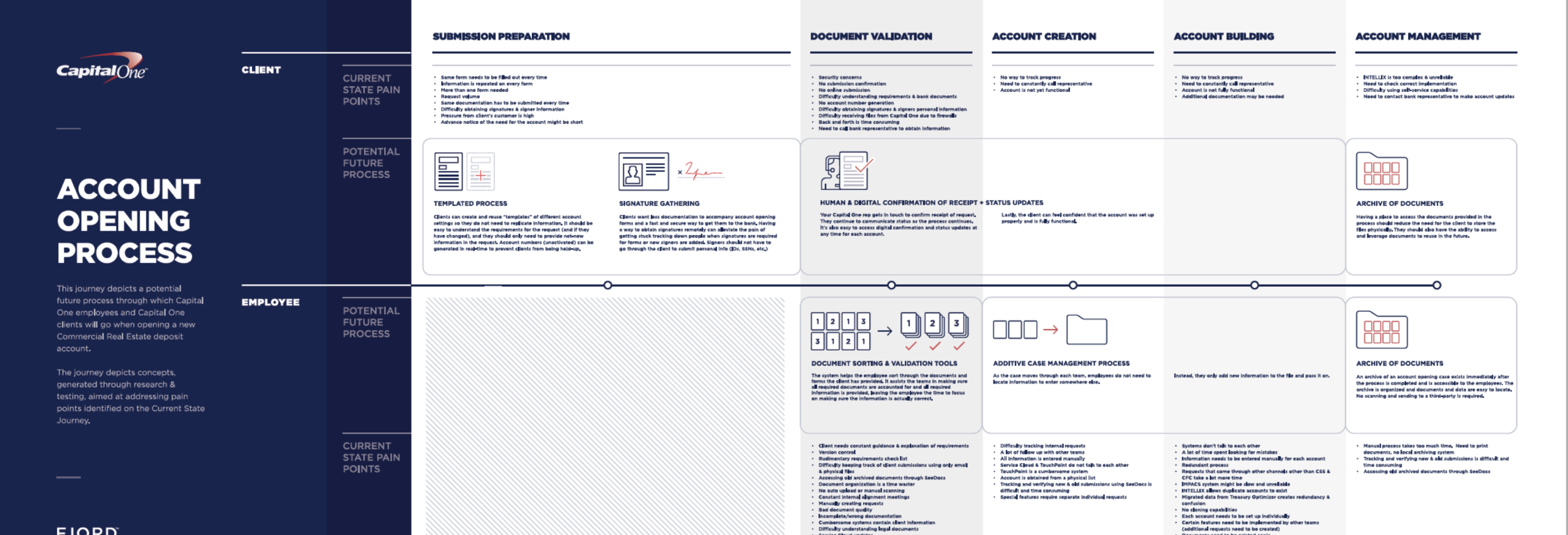
Validation Round 2
We ran a second phase of Validation in order to test the flows and solutions we had implemented in our Prototypes.
We decided to craft two separate User Journeys to provide a clear idea of how the process worked today and how it could work in an ideal Future State.

Detailed Design
We then proceeded to create Wireframes and Visual Designs for the entire Account Opening experience.
Several Prototypes were developed using both the Wireframes, and the Visual concepts, addressing each of the scenarios mentioned earlier.


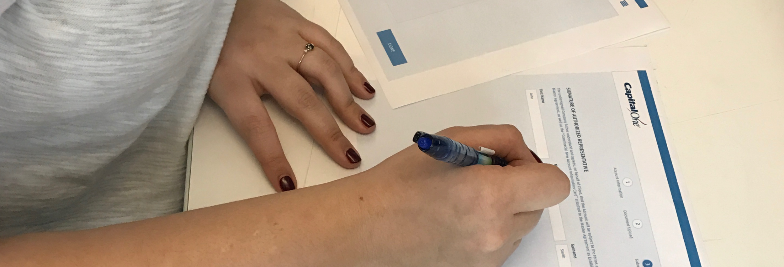
Testing
A final testing campaign was executed in order to validate functionality, and assess how the end users felt about the new experience.
A different set of testing sessions were held with internal Associates to help them understand how the new client experience would benefit their workflow even tough, at this point in time, we were not able to address the experiences on their side.

Outcome
As part of the execution of the solutions presented to the team. We crafted specific recommendations for future work to be done as the project moved forward internally.
Value user feedback
The design should grow and scale as a result of constant feedback from users.
Avoid unnecessary customizations.
Users will always have very specific needs and requests. Don’t overcomplicate the design and strive for global solutions.
Fewer Steps is not always best.
Research showed us that sometimes breaking up information allows for an easier understanding of the process.
Reduce user effort
Reduce the amount of information the user needs to provide by allowing the system to reuse and pre-populate information as much as possible.